91-DIVOC Visualizations
- Classic Graphs: Countries & US States (#01) and Illinois Regions & Countries (#05)
- County-Specific Data: COVID-19 Data for Locations of People You Love (#02)
- Stacked Contributions Graphs: States in the US (#04) or Countries in the World (#07)
- Experimental: 1,000-Person Community (#03)
Daily, Every Day: Updates to All Charts and Datasets
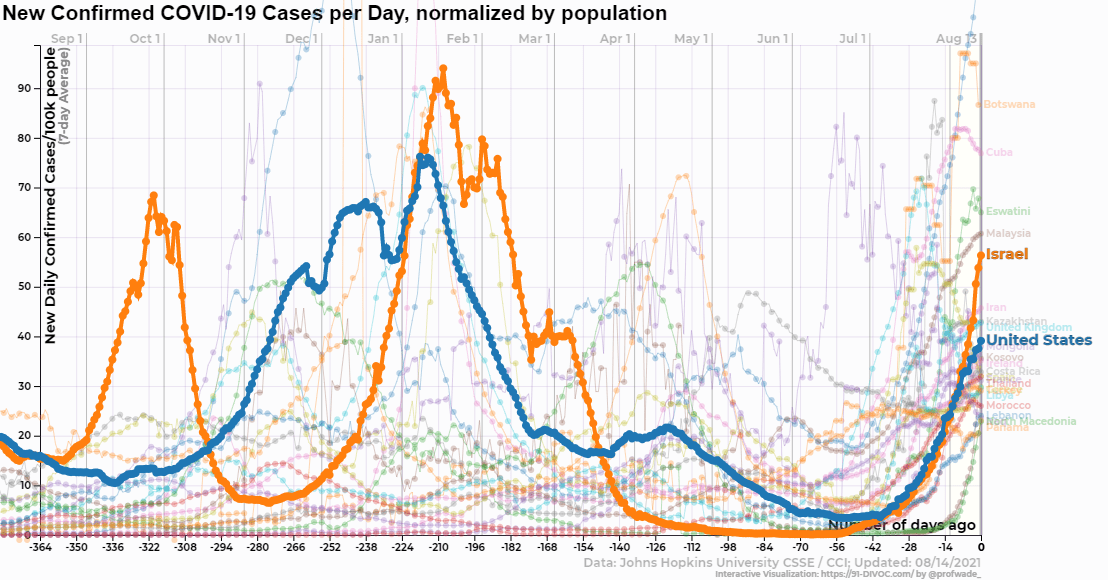
Every day, all 91-DIVOC visualizations are updated with the latest data compiled from various data sources across the Internet.
August 18, 2021 – Lowest/Highest Value Since in Mouseovers
When you mouseover (or tap) a data point and the datapoint is the a low or high value that hasn’t been seen in at least 10 days, the mouseover now displays the last time that value was above/below that value. For example:
-
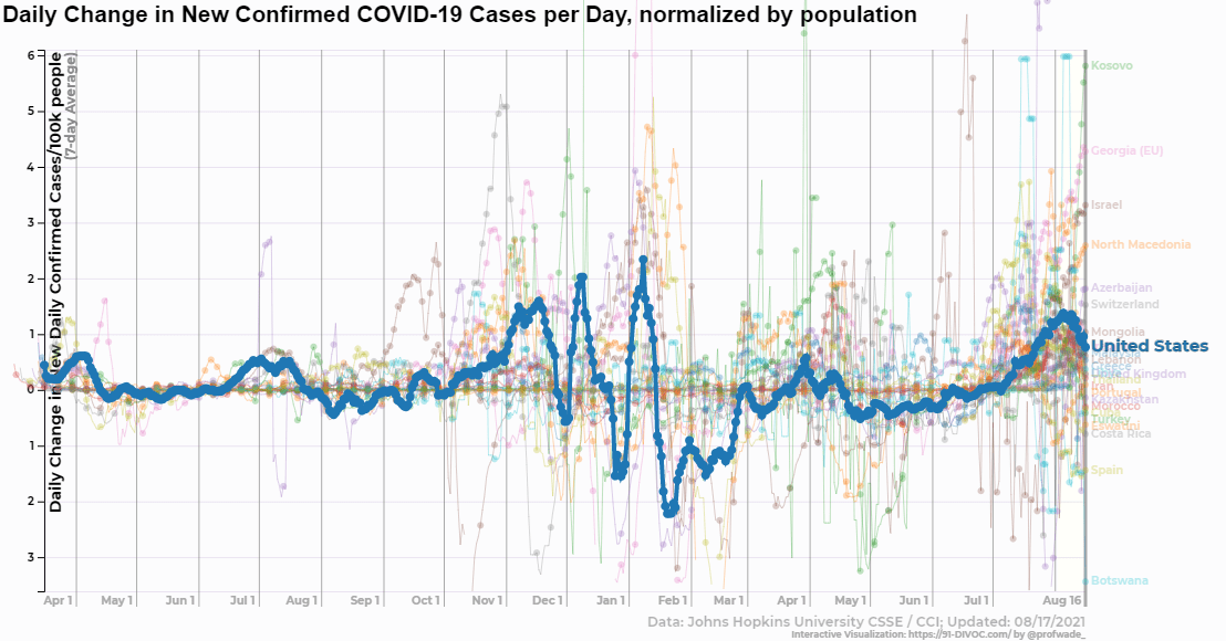
In the United States, on Aug. 17, we had the highest value of new confirmed cases since Feb. 3, 2021 – or 194 days ago.
-
The image linked goes to a graph of the daily change in new confirmed COVID-19 cases per day, one of the few graphs where the United States is showing signs of improving in mid-August where cases are increasing at a decreasing rate, you can find that on Aug. 17 is the lowest value since 25 days ago – on July 22nd.
In addition, the “X-Axis” has been updated with additional axis options to display gridlines as weeks or months. :)
August 17, 2021 – Improved Responsiveness - Fixes
Fixed a bug related to graphs not updated upon switching to a new “Data Source”.
August 16, 2021 – Improved Responsiveness
As the amount of COVID-19 data grows, the 91-DIVOC has more and more points to render and mouseovers for you to highlight to dive deeper into the data. This past weekend I added the ability for the site to “know” which graph(s) are on your screen and only keep those graphs in memory. From my testing, it appears it have made the option selection more responsive and the initial page load faster. :)
Additionally, the x-axis now uses a date scale and looks significantly better on mobile (where, previously, the axis labels started to fall on top of themselves).
August 15, 2021 – Additional Scaling Options
A brilliant suggestion was made to expand the x-axis scaling to include additional periods – “X-Axis” now includes two new views:
- Recent (1/2) year
- Recent 1 year
Additionally, a few more small updates:
- Used a “waypoint” approach to loading graphs, so graphs currently not in view are not rendered (improving the initial load time of the page on slower devices).
- Selecting “(None)” and “Y-Axis: All Data” now correctly displays all of the visible data.
July 15, 2021 – Cleanup Datasets without Updates
The “COVID Tracking Project” no longer is providing COVID-19 data updates and has been removed as a data source.